
How to Aggregate LLM Latency and Usage: A Worked Example
Your dashboard says the average response takes 1.2 seconds. Your users say the app feels slow. Both statements are true, and that is the problem.

Key topics
Your dashboard says the average response takes 1.2 seconds. Your users say the app feels slow. Both statements are true, and that is the problem.
A metric is not a property of your system. It is a property of a decision you made: which events you counted, over what window, and which summary you applied. Change any one of those three and the number changes — honestly, defensibly, and in a way that makes two teams argue about the same week of traffic.
This article is about that decision layer. We will take ten hypothetical requests, compute the summaries by hand, and watch how the same trace produces two different "average latencies" depending on what we decided to count. Aggregation is a definition problem before it is a math problem.
Why Your Latency Number Is a Definition, Not a Measurement
Every aggregate you report is the output of a function:
metric = summarize(events, window, statistic)
Three inputs, one number. If two dashboards disagree, they almost always differ on one of those three inputs, not on the arithmetic.
The failure families split cleanly:
- Scope errors — you counted the wrong events. Retries logged as new requests. Timeouts that never emitted a completion event. Cached responses mixed with fresh generations.
- Summary errors — you counted the right events but described them with the wrong statistic. A mean standing in for a distribution with a long right tail.
Traces give you raw events. Aggregation is the layer that turns those events into claims about your system. If you have not yet set up tracing, that is the prerequisite — this article assumes you already have request events landing somewhere queryable and you can read a span.
The rest of this article is a single worked example that makes both failure families visible.
Notation and Scope: What Counts as One Event
Before any arithmetic, fix the notation. For a single request :
| Symbol | Meaning |
|---|---|
| When the request was sent | |
| When the first output token arrived | |
| When the last output token arrived | |
| Input tokens | |
| Output tokens |
From those, the derived per-request quantities:
- TTFT (time to first token):
- Generation duration:
- End-to-end latency:
- Tokens per second:
End-to-end latency decomposes as . That decomposition matters later: a slow response is either slow to start, slow to stream, or simply long.
Now the scope rules — the decisions that determine which events enter the set:
- What is one request? A retry after a timeout is a second model call but arguably one logical user request. A fallback to a different provider is the same story.
- Do cached responses count? A cache hit has near-zero latency and zero output tokens. Including it drags every summary toward optimism.
- Do failed requests count? A request that timed out at 30 seconds and never completed is a real user experience. Excluding it biases the tail downward.
- Are units and windows comparable? Milliseconds versus seconds, and a five-minute window versus a week, produce different numbers from identical events.
Common mistake: Logging each retry as a new request. The denominator inflates, the retry's latency enters the distribution as if it were a fresh user request, and the tail looks healthier than the experience actually was. If a request retried twice before succeeding, you have one slow user experience and three telemetry events.
The assumption that makes any aggregation valid: comparable events, comparable units, comparable windows. Break it and the number is not wrong in the arithmetic — it is wrong in the claim.
Knowledge check
Check your understanding
Answer this question before you continue.
A Worked Trace: Ten Requests, Two Metrics
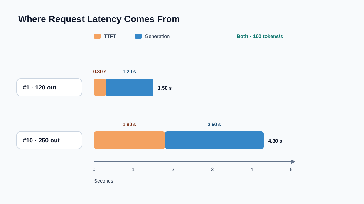
Here is a compact trace. Ten requests, all to the same model version, all with the same prompt template, all in one hour. TTFT and end-to-end latency in seconds.
| # | TTFT | Gen duration | End-to-end | ||
|---|---|---|---|---|---|
| 1 | 0.30 | 1.20 | 1.50 | 400 | 120 |
| 2 | 0.28 | 0.90 | 1.18 | 380 | 90 |
| 3 | 0.35 | 1.60 | 1.95 | 420 | 160 |
| 4 | 0.31 | 1.10 | 1.41 | 390 | 110 |
| 5 | 0.29 | 0.80 | 1.09 | 410 | 80 |
| 6 | 0.33 | 1.40 | 1.73 | 400 | 140 |
| 7 | 0.30 | 1.00 | 1.30 | 395 | 100 |
| 8 | 0.27 | 0.70 | 0.97 | 385 | 70 |
| 9 | 0.34 | 1.30 | 1.64 | 405 | 130 |
| 10 | 1.80 | 2.50 | 4.30 | 400 | 250 |
Request 10 is the outlier: a cold start, a provider hiccup, or a genuinely longer answer. We will keep it, because excluding it is exactly the kind of scope decision that hides user pain.
Per-request tokens per second. For request 1: tokens/s. For request 10: tokens/s. Same streaming rate — request 10 is slow because it started slowly and produced more tokens, not because generation degraded.
Arithmetic mean of end-to-end latency:
Arithmetic mean of TTFT:
Notice what request 10 did: it pulled the mean TTFT from roughly 0.31 s to 0.457 s. One request out of ten moved the average by nearly 50%.
Percentiles. Sort the end-to-end latencies ascending:
0.97, 1.09, 1.18, 1.30, 1.41, 1.50, 1.64, 1.73, 1.95, 4.30
Using the nearest-rank convention — the smallest value at or above the -th percentile position — with :
- p50 (median): position → 1.41 s
- p90: position → 1.95 s
- p95: position → 4.30 s
That p95 is worth pausing on. With ten samples, the 95th percentile is the worst request. Small samples make tail percentiles jumpy — a fact that will matter when you compare two weeks of traffic.
Note: Percentile conventions differ. Nearest-rank picks an actual observed value. Linear interpolation (the "inclusive" method common in monitoring tools) averages between neighbors. On this trace, interpolated p95 lands near 3.13 s instead of 4.30 s. Same events, same percentile label, different number. Always state the convention.
Token usage. Total input tokens: 3,985. Total output tokens: 1,250. Mean input per request: 398.5. Mean output per request: 125.
Now the weighting question, and it is worth being precise because the labels get sloppy. The mean output tokens per request is the total divided by the request count: . That is a request-weighted average — every request contributes one data point, regardless of how long it was.
A token-weighted rate answers a different question: across all the tokens you generated, how fast did they stream? You compute it as aggregate output tokens divided by aggregate generation time:
The request-weighted mean of per-request rates is also 100 tokens/s here, because every request streamed at the same rate. Change one request and the two diverge. Suppose request 10 had streamed at 50 tokens/s instead of 100 — its generation duration would be s. The request-weighted mean of per-request rates becomes tokens/s. The token-weighted rate becomes tokens/s. The token-weighted number is lower because the slow request carried more tokens, and those tokens dominate the aggregate.
Neither number is wrong. They answer different questions. Request-weighted tells you what a typical request experienced. Token-weighted tells you how efficiently the serving layer moved the total workload.
The same trace, two summaries. If you report "average latency: 1.71 s," you are describing a system where the typical request finishes in about 1.4 s and one request in ten takes over four seconds. If you report "p50: 1.41 s, p95: 4.30 s," you are describing the same system honestly. The first number is not wrong. It is just answering a different question than the one your users are asking.
Knowledge check
Check your understanding
Answer this question before you continue.
Average vs Tail Percentiles: What Each One Hides
Latency distributions are right-skewed. Most requests cluster near the median; a few stretch far to the right. The mean is sensitive to those few. The median barely notices them.
That asymmetry is why "healthy average, unhappy users" is such a common pairing. On our trace, the mean sits at 1.71 s — comfortably under a two-second budget. The p95 sits at 4.30 s, well over it. If your timeout is three seconds, roughly one request in ten is failing, and the average never told you.
The tail also compounds. A request that calls the model three times in a pipeline — retrieve, generate, verify — inherits three independent chances to hit the slow path. If each call has a 5% chance of being slow, the pipeline has roughly a chance of containing at least one slow call. Tail latency in multi-step systems is not the tail of one call. It is the tail of the slowest call in the chain.
My rule for choosing a summary:
- p50 for typical user experience. This is what most people feel most of the time.
- p95 and p99 for user-facing promises, timeouts, and SLOs. This is where perceived slowness lives.
- The mean only when you also report the spread. A mean without a p95 is a claim without a caveat.
Tip: If you can only put one latency number on a dashboard, put p95 there. It is the number that predicts complaints.
Knowledge check
Check your understanding
Answer this question before you continue.
Aggregating Usage Without Double-Counting
Token aggregation looks like addition. It is actually another scope problem.
Input, output, and cached tokens are different quantities with different costs. Collapsing them into a single "tokens" number destroys the signal you need for cost analysis — cached input tokens are typically far cheaper than fresh output tokens, and a system that shifts work from output to cached input can look flat on total tokens while its bill drops.
Then there is the retry problem again. If a request retries twice, you have three sets of token counts. Are you counting billed tokens (what the provider charged you) or logical-request tokens (what one user interaction consumed)? Both are legitimate. They answer different questions. Mixing them produces a number that answers neither.
The same weighting question from latency applies here:
| Question | Weighting | Why |
|---|---|---|
| What does a typical request cost? | Request-weighted | Each user interaction counts once |
| How efficient is the serving layer? | Token-weighted | Long requests dominate the work |
| What will the bill be? | Sum of billed tokens | Provider charges per token, not per request |
A long request and a short request should not count equally when you care about throughput. They should count equally when you care about user experience.
Practical rule: Store raw per-request usage events and derive aggregates from them. If you only store the aggregate, you can never re-slice by model version, prompt version, or input-token bucket — and you will eventually need to.
How Missing and Differently Scoped Events Distort Comparisons
This is where the definition problem becomes expensive. Two weeks of data, two dashboards, two conclusions.
Missing events. Dropped traces, sampled telemetry, and timeouts that never emit a completion event all bias the tail downward. A request that hung for 30 seconds and was killed by a client timeout may never produce a completion span. Your p95 improves because the worst requests vanished from the dataset, not because the system got faster.
Scope drift. A deploy adds a retry, a cache, or a streaming path. The events still flow. The denominator silently changes meaning. Week-over-week latency "improves" because cached responses now dilute the distribution.
Segment before comparing. Model version, prompt version, input-token bucket, endpoint. A TTFT regression is often a prompt that grew, not a model that slowed — check input size before blaming infrastructure. On our trace, request 10's TTFT of 1.80 s would look alarming until you noticed its input was the same size as the others, which rules out prompt growth and points at a cold start or provider event.
The detection habit. Compare event counts and token totals alongside latency. A latency drop accompanied by a falling event count is usually a measurement change, not a performance win. If your p95 improved 20% and your request count dropped 20%, you did not get faster. You lost data.
Warning: Never compare percentiles computed with different conventions or over different event scopes. Nearest-rank p95 from one tool and interpolated p95 from another are not the same statistic, even when they share a label.
Knowledge check
Check your understanding
Answer this question before you continue.
When to Use Which Summary
A short decision table, because the choice should be mechanical once you know the question:
| You want to know... | Use | Avoid |
|---|---|---|
| Typical user experience | p50 | Mean |
| Whether you are meeting a promise | p95 / p99 | Mean |
| Total capacity and cost | Mean and sums | Percentiles alone |
| Serving efficiency | Token-weighted throughput | Request-weighted |
| Whether a change helped | Segmented p50 + p95, same scope | Blended numbers |
Two things not to do:
- Do not blend across models, endpoints, or prompt versions when you intend to compare them. A single number across three model versions tells you nothing about any of them.
- Do not compare percentiles across different conventions or scopes. If the scope changed, the comparison is invalid before the arithmetic starts.
Write Down the Definition Before You Trust the Number
Before you trust any latency or usage number, write down three things: the event scope, the time window, and the percentile convention that produced it. If you cannot fill in all three, you do not have a metric. You have a number that happens to be on a screen.
Here is the next move I would make. Pick one metric on an existing dashboard — the average latency, the p95, the daily token total — and recompute it by hand from the raw events for a single hour. Then compare. If your hand-computed number differs from the dashboard, you have found a scope decision nobody documented. That gap is the most valuable thing you will learn this week, and it costs one query and ten minutes.
Knowledge check
Final check
Finish the article by checking the ideas you just learned.
References
Want a more structured LLMOps path?
Use the LLMOps Practical Starter Bundle to connect RAG, evaluation, observability, and production patterns.
Large Language Models Starter Pack
A 12-chapter guide connecting LLM fundamentals with prompting, RAG, agents, tool calling, evaluation, security, and application engineering.
- 227-page Illustrated PDF edition
- 12 guided LLM engineering chapters
- Visual concept diagrams
- Self-assessment quizzes
- Bonus deep-dive sections
- Prompt design, structured output, context windows & RAG pipelines
- Agents, tool calling, prompt injection, evaluation & application lifecycles
Coming soon


